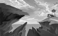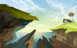

Photoshop CS2. Ah, so cliched, I know~ I wanted to try out some new brush techniques for this class assignment. Started with a B/W tonal then added colours using overlay layers. The sky was fun to paint. The water was the hardest >:0 Critiques please!

9 comments:
That's so awesome! Really! *__*
Some time ago I sat on pretty similar landscapes and...I failed so hard. XD
I like these so much better. Maybe it's because they are overall rougher and more stylized... And there is some kind of focus in the middle, that pulls you in.
Sorry...no real constructive critique I guess. ^^°
Lol that's ok~ Still much appreciated <3 I'm striving for a more stylized painting look, gotta keep practicing! ^^;
Incredible work! Your brush strokes are really nice and confident; the colors look great too.
Crits? the focal point is confusing, I don't know where to look.
I just think you need to separate the planes better. Right now the cliff on the left is darker, appearing to be closer to the viewer, even though the rocks below actually are.
Also, there doesn't seem to be any pure white in the painting, so if you added some to the lighthouse or that area, it would add more contrast, drawing the eye there.
Hopefully this helps, this is just how I would have handled it, so take it as a grain of salt if you wish.
cool stuff dude. I love your rice story down there!
@Scott: Thanks so much! Yeah, I tried to make the eye direction go towards the lighthouse, with the cliff and clouds kinda pointing towards it, but it ended up all over the place :S Sigh, still got much to learn~
@Seo: I finally made rice successfully a couple weeks ago, lol And thanks for checkin' out my blog! ^^
You're the one with the awesome life drawings I've seen in the hall. You've got a sweet style.
I think your painting is too cluttered. Maybe bring the lighthouse further into the image and make the other rocks less prominent by bringing them further off the page. space things out more. Make the lighthouse the focal point. The rendering and the colors are fine though. Also your sketchbook pages are wicked. Sweet blog!
neat stuff! i like the shapes of the clouds alot. Everyone's giving u great critiques, u should b happy lol.
If u just frame it well and play with contrast/lightness more, it'll look even greater!
This really does look great. I wish I could figure out digital painting, but so far, no luck.
Anyway, you asked for critiques, so: As far as composition goes, I'd say that the two rocks at 5-6:00 are doing the most damage to the focal point. They should be pointing towards the lighthouse, or perhaps you could simply leave them without a directional push, as you already have that covered with the main cliff. Also, I'd say you could make them smaller. That way they would still hold in the bottom of the image, but don't overpower the strong vertical shape of the lighthouse. I would be personally inclined to make the rock at 8:00 more horizontal, but that might make it look too graphic. Also, I might recommend that you somehow boost the contrast around the lighthouse (darker sky or darker house), as the main tonal contrast right now is the cliff face against the light blue sky.
However, with that said, you've got a ton of great stuff happening here. The clouds, the two larger rock shapes, the path, all are working very nicely. And, as I've said, the painting technique and colour sense blows me away. Keep up the great work, I'll be coming back to your blog often.
Thanks so much for all the critiques, guys! ^^ They were definitely helpful~ I'll try to keep posting more layout stuff and getting feedback from now on :D
Post a Comment